top of page
Graphic Designer


DENVER KUNG FU
Brand Identity • Marketing Design • Campaign Strategy
Denver Kung Fu needed a cohesive visual identity that balanced traditional martial arts culture with a more modern, approachable presentation for new students. My role involved restructuring the brand system, redesigning marketing materials, and developing a consistent digital campaign strategy across social media, web, print, and local advertising.

Branding Materials
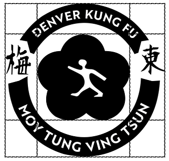
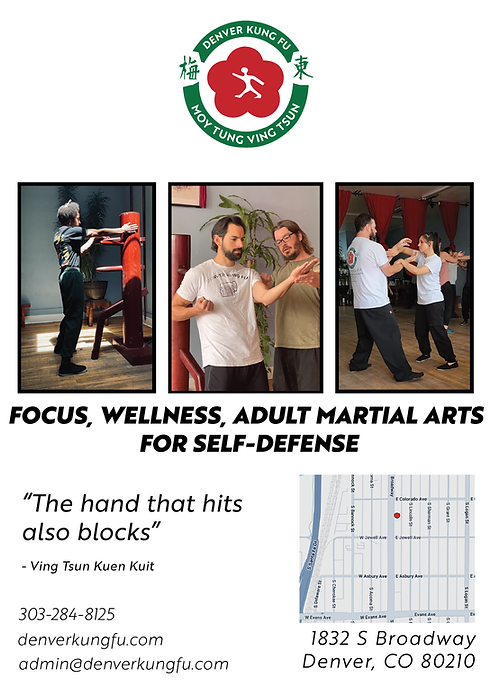
The original branding lacked consistency across print and digital applications, making it difficult to establish a recognizable visual presence. The updated identity system focused on improving clarity, maintaining cultural authenticity, and creating a scalable foundation for marketing campaigns and student outreach.
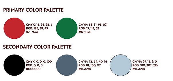
The color palette was designed to reflect both tradition and modern discipline. The red brings energy and focus, while the forest green adds grounding and growth. The supporting tones of black and soft blues create contrast, depth, and refined visual identity.
Brother 1816 was selected for its strong, structured form and clean readability. Its bold, modern character reinforces discipline, clarity, and confidence.


Marketing Materials
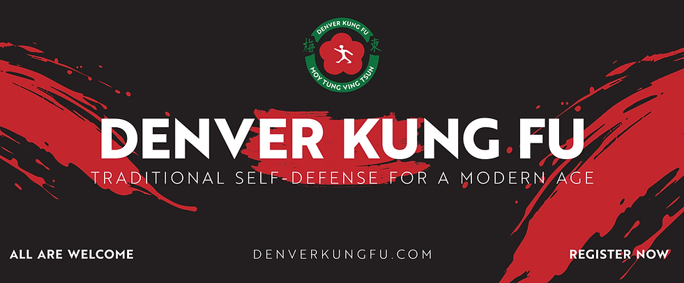
The studio relied heavily on community outreach, local events, and beginner enrollment campaigns. These materials were designed to create stronger visual consistency while improving readability, audience targeting, and call-to-action clarity across both digital and print formats.
.png)
Community Outreach

-01.png)
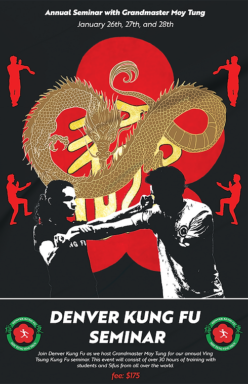
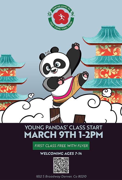
To support community outreach and long-term student growth, a cohesive marketing system was developed across both digital and print materials. Posters, flyers, event promotions, and social media graphics were designed to maintain a consistent visual identity while improving readability, recognition, and communication across multiple touchpoints. The goal was to create marketing materials that not only promoted classes and events but also reinforced the professionalism, culture, and accessibility of the school for both new and returning students.
Process Work
.png)
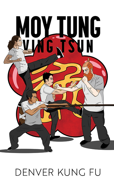
The development process focused on creating a cohesive visual system that could adapt across branding, marketing, and digital platforms while remaining authentic to the school’s traditional identity. Initial concepts explored layout structure, typography, imagery, and campaign direction through sketches, iterative design studies, and early marketing applications. Each stage of the process was refined to improve consistency, strengthen communication, and create a more unified experience across print materials, social campaigns, and web design.
.png)
Programs and Campaigns


bottom of page